Seraph
A step in the evolution of democracy
OOUX
Research
Wireframes
Flow Diagrams
Hi-Fidelity UI
Accessiblity Evaluation
Where
Iowa, USA
What
Native Mobile App
Why
Portfolio Project
Role
Designer, Researcher
Category
Governmental/poltical
When
September 2023
Overview
Seraph is an exploration into what an application could do to solve political organization on a wide scale. It seeks to make government: accountable, transparent and easy to interface with. Inefficiency is anathema to that mission. With even today’s technology it’s possible to create a better system that encourages useful debate, allow for change and to increase public trust in democracy.
The design of the brand and ecosystem, where this app inhabits, exemplifies its goal to make government work better for humans and less for conglomerations.
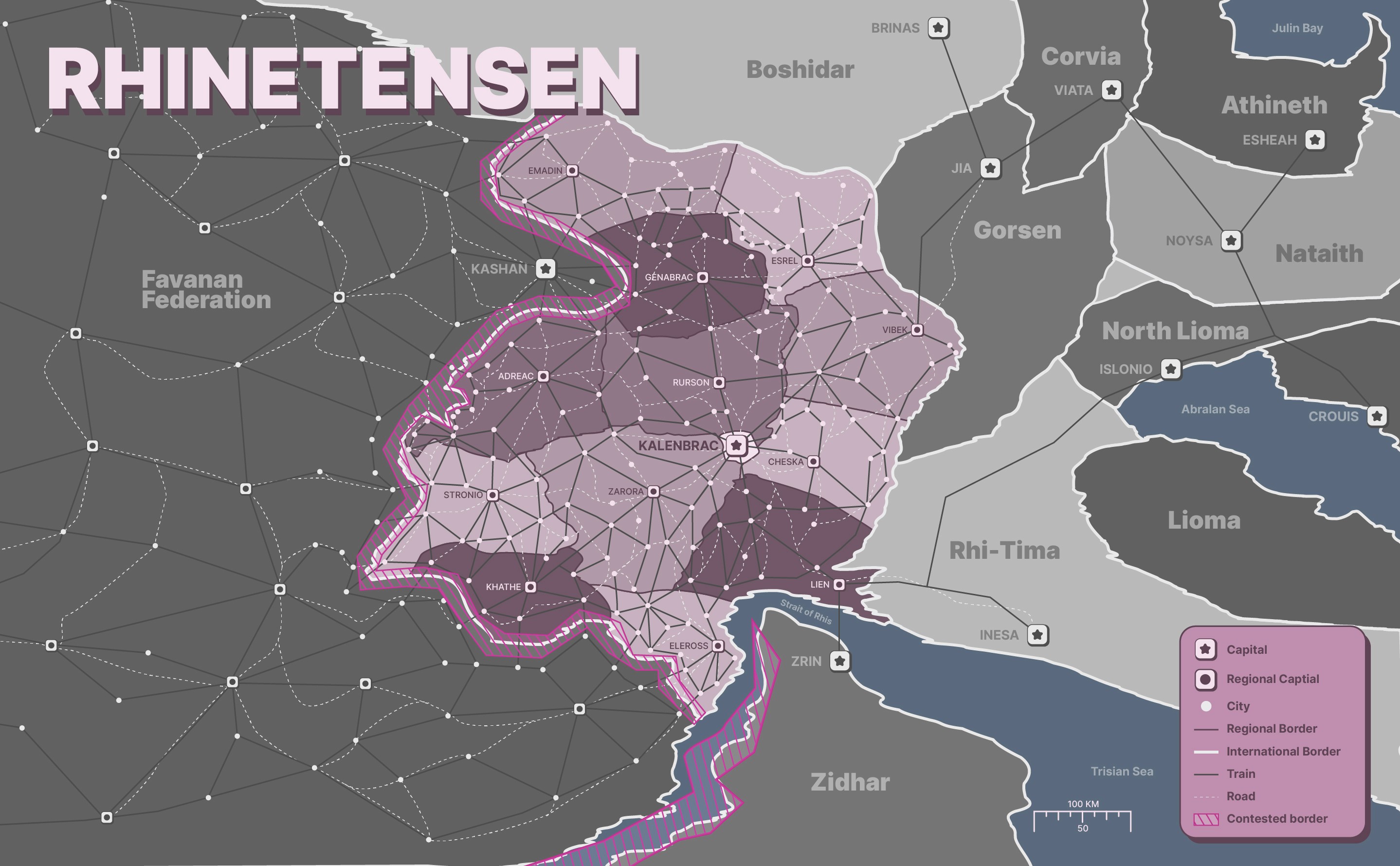
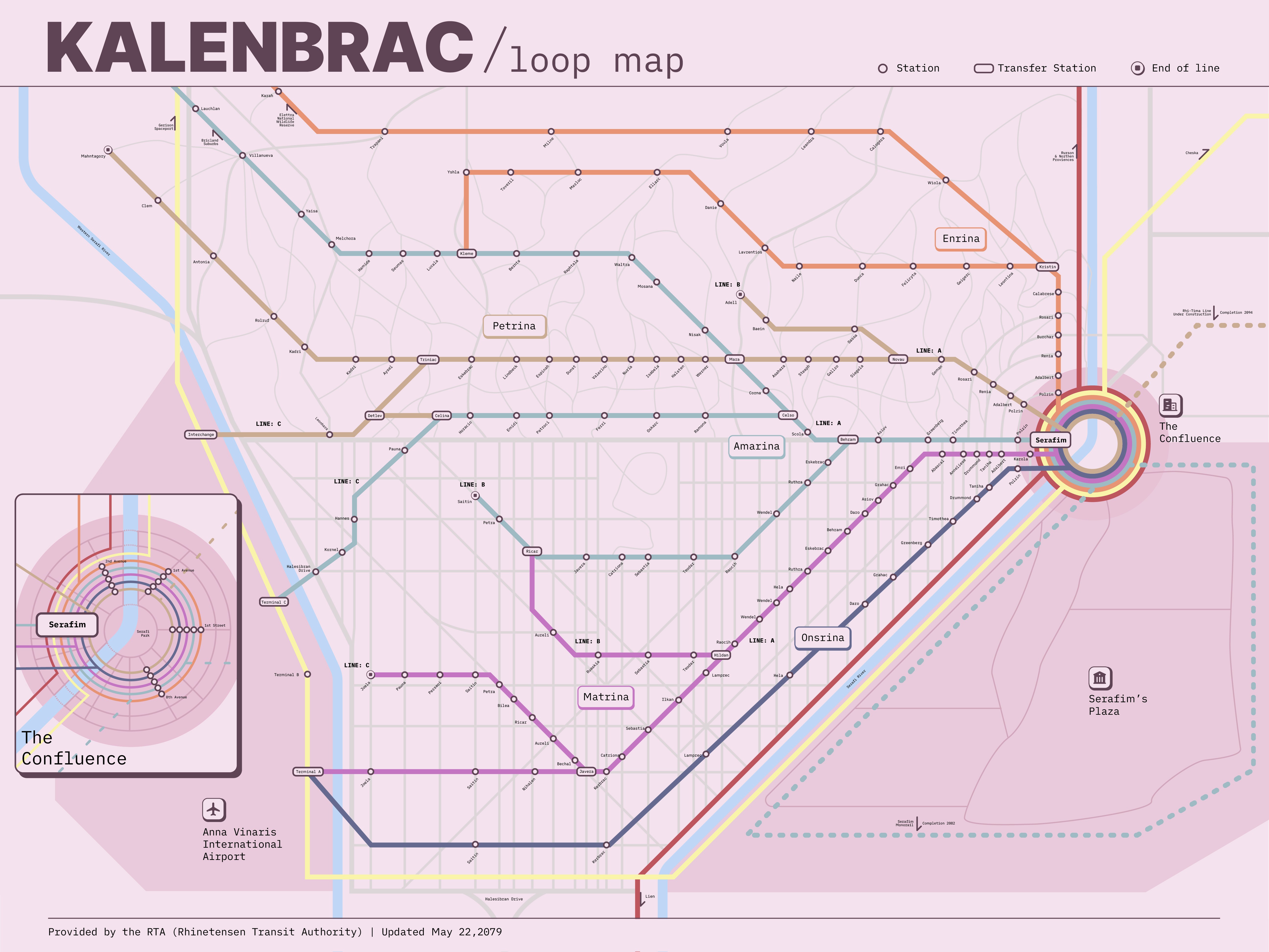
Train map for the captial city of a fictional city called Rhinetensen, using this system.
Brand System
The goals for this system were to generate a brand that followed a few general precepts:
Accessible
Inviting
Trustworthy
Warm
When most people think of government they think of taxes, extremely long forms, in other words it's a chore to interact with government. The long lines of red tape and bureaucracy create a tangle of wires so thick not even the best cable management scheme could hope in making it disappear.
Therefore to counteract this impression the brand is necessary to be warm, inviting, yet still look trustworthy.
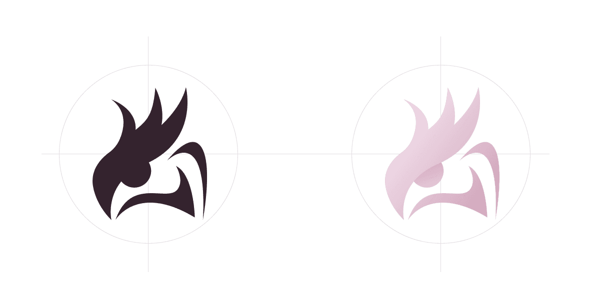
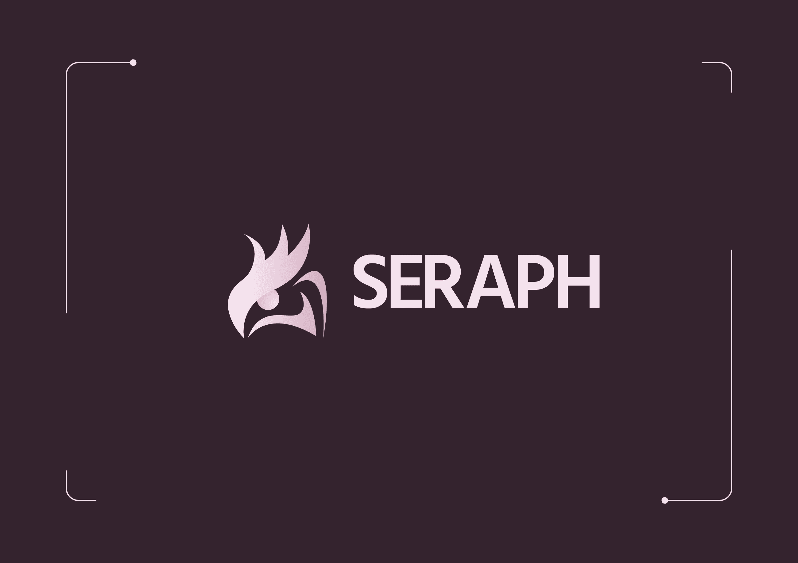
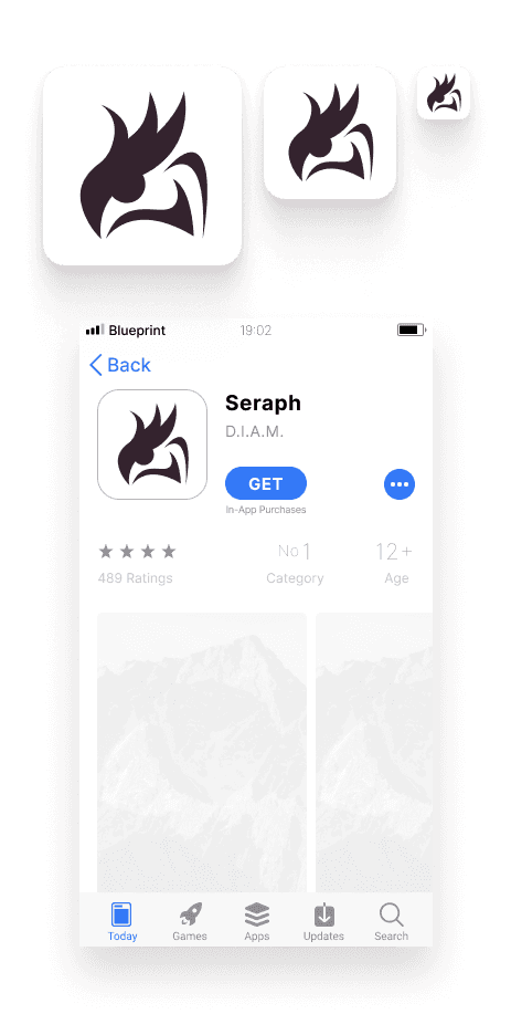
Logo
The icon is akin to the phoenix, a mythical bird of flame that rises from the ashes when it dies. This symbology carries from the mission statement, that it is a new dawn, new outlook, or fresh start from what has come before; allowing for innovation and unique ideas, the space to breathe. Choosing this design embodies this core sentiment.
The wordmark uses Hind bold typeface, the softened humanistic sans-serif has some flare to it, and falls directly into the main pillars of the design for this brand. This wouldn't be used very often, given the ubiquity of the app if it was adopted, as it would be simplified to only the icon after a time.
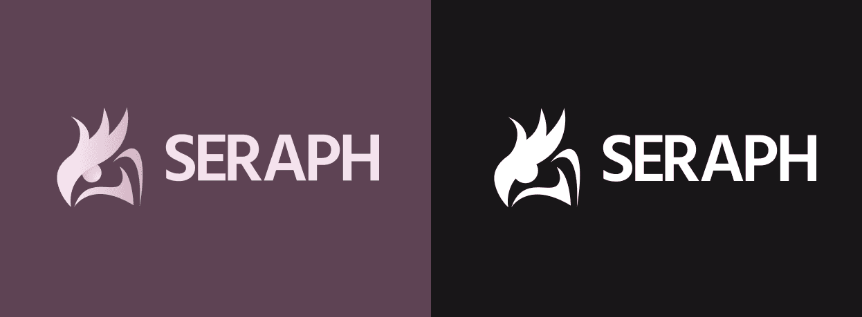

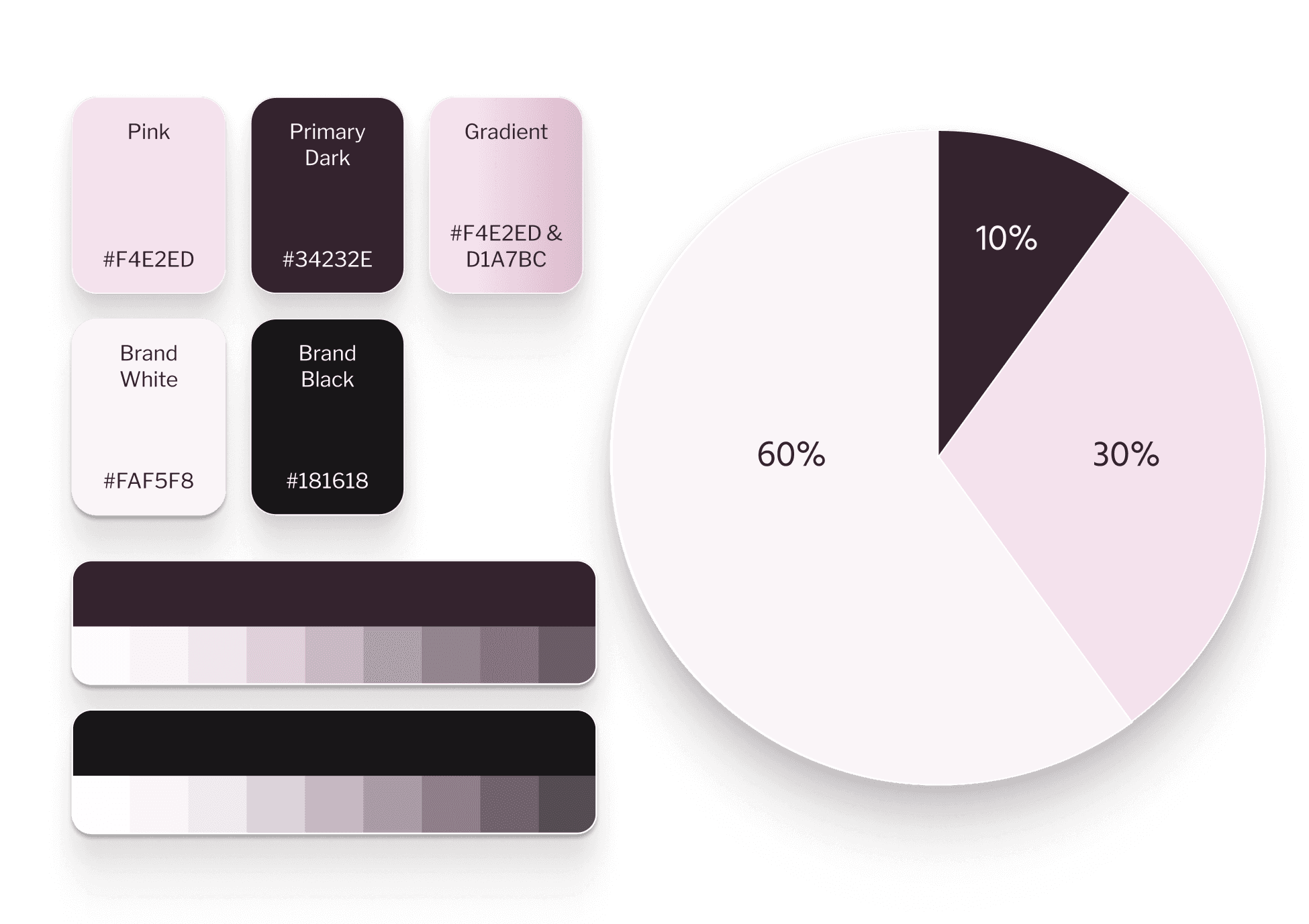
The colors chosen are a warm pink-purple on the spectrum. This neutral earth tone color palette is warm, but desaturated, which also enforces the pillar of trustworthiness.
Font Selection
The two chosen for this project are Hind for headers and Libre Franklin for body copy. Boasting high-readability on small screens they are ideal for an application only used on a mobile device. The humanistic style of Hind contrasts well with the geometric nature of Libre Franklin. Both are simple fonts that exemplify professionalism while allowing some softness to come in with Hinds rounded characters.